
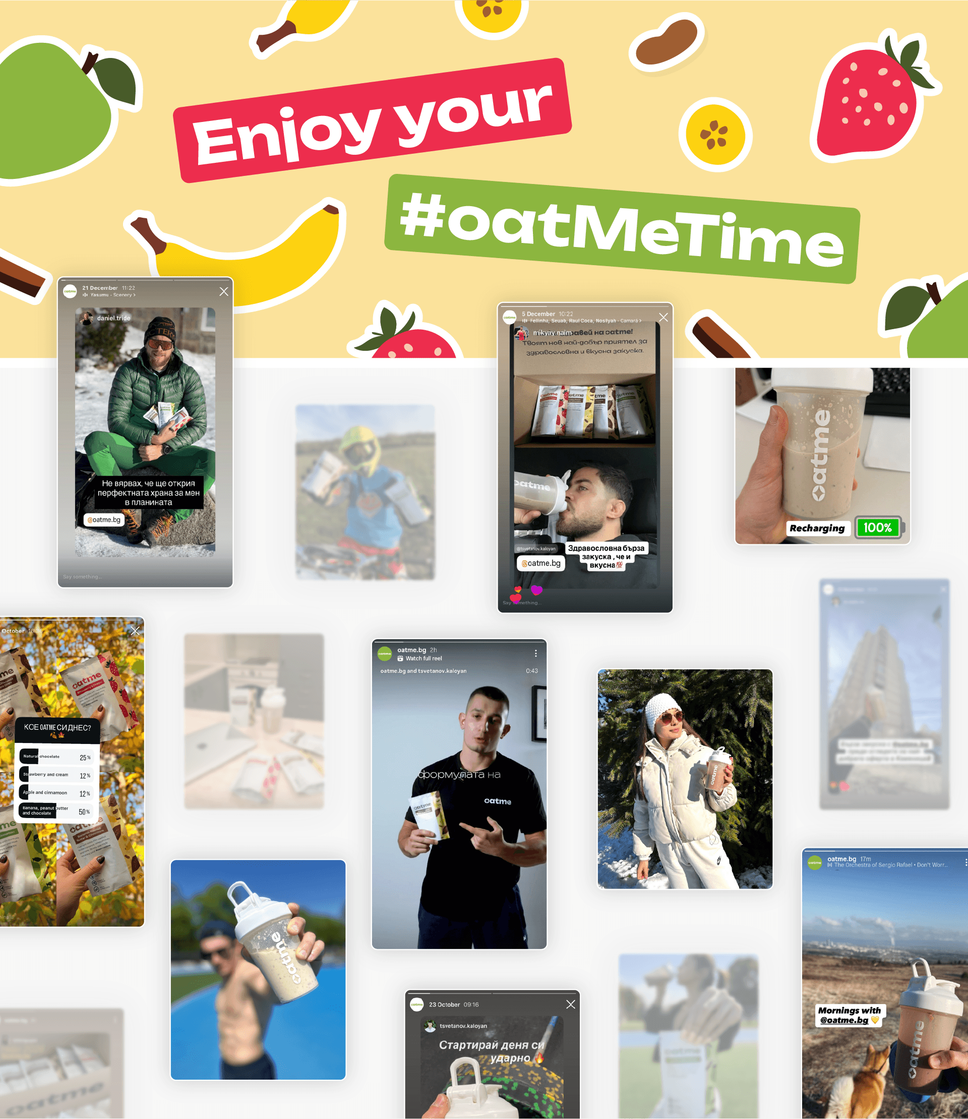
Overnight oats for your me time.
Oatme is for those who don't compromise on breakfast. For those who know that the day is defined by the morning. And who doesn't rush breakfast, but break-slow. Oatme cares for everyone who believes in slow living and for whom delicious and healthy food should be prepared and consumed slowly – with pleasure.
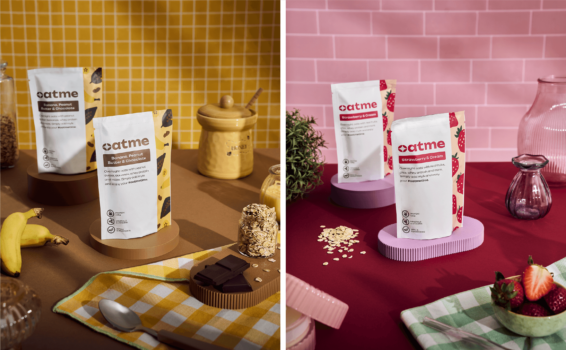
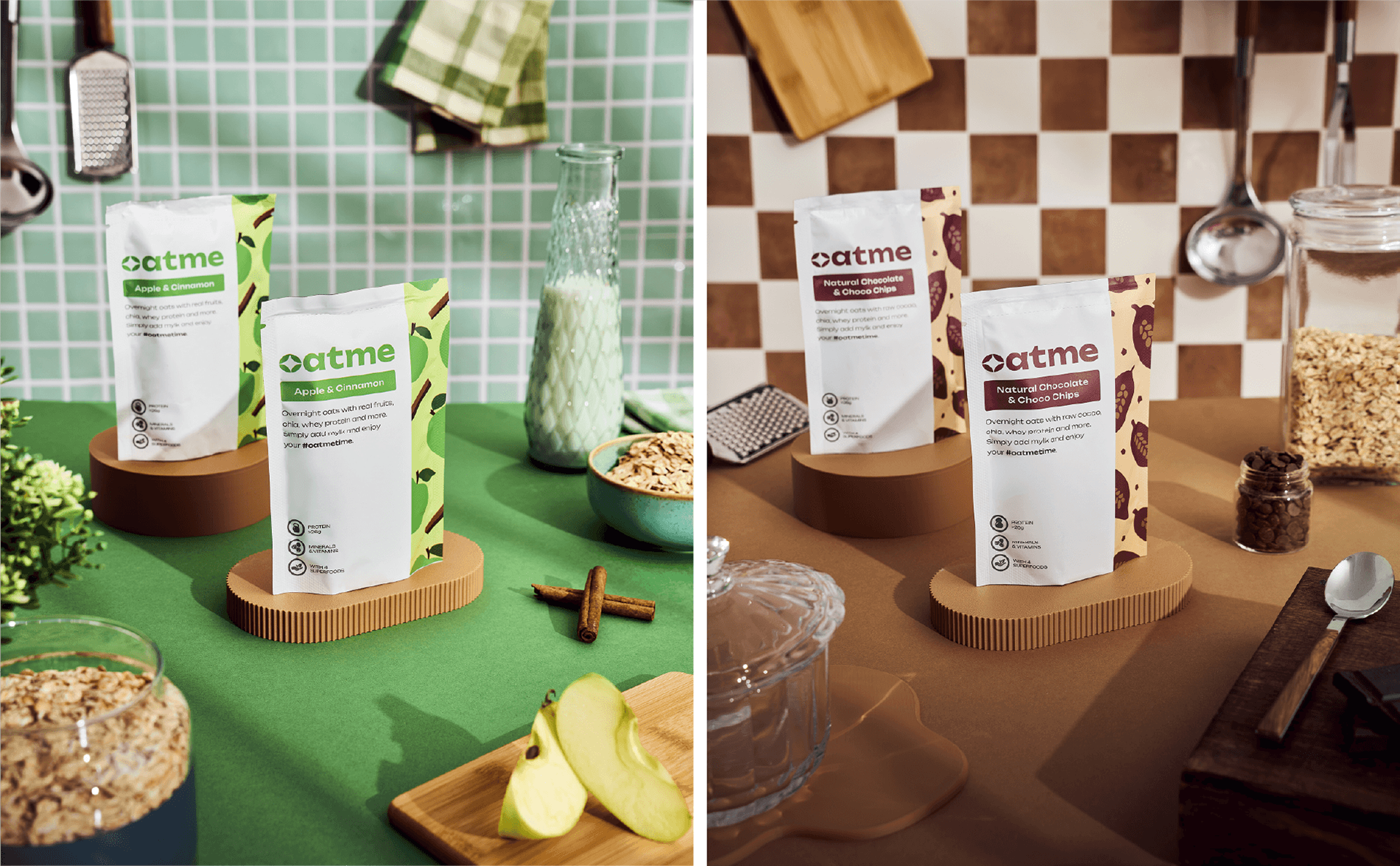
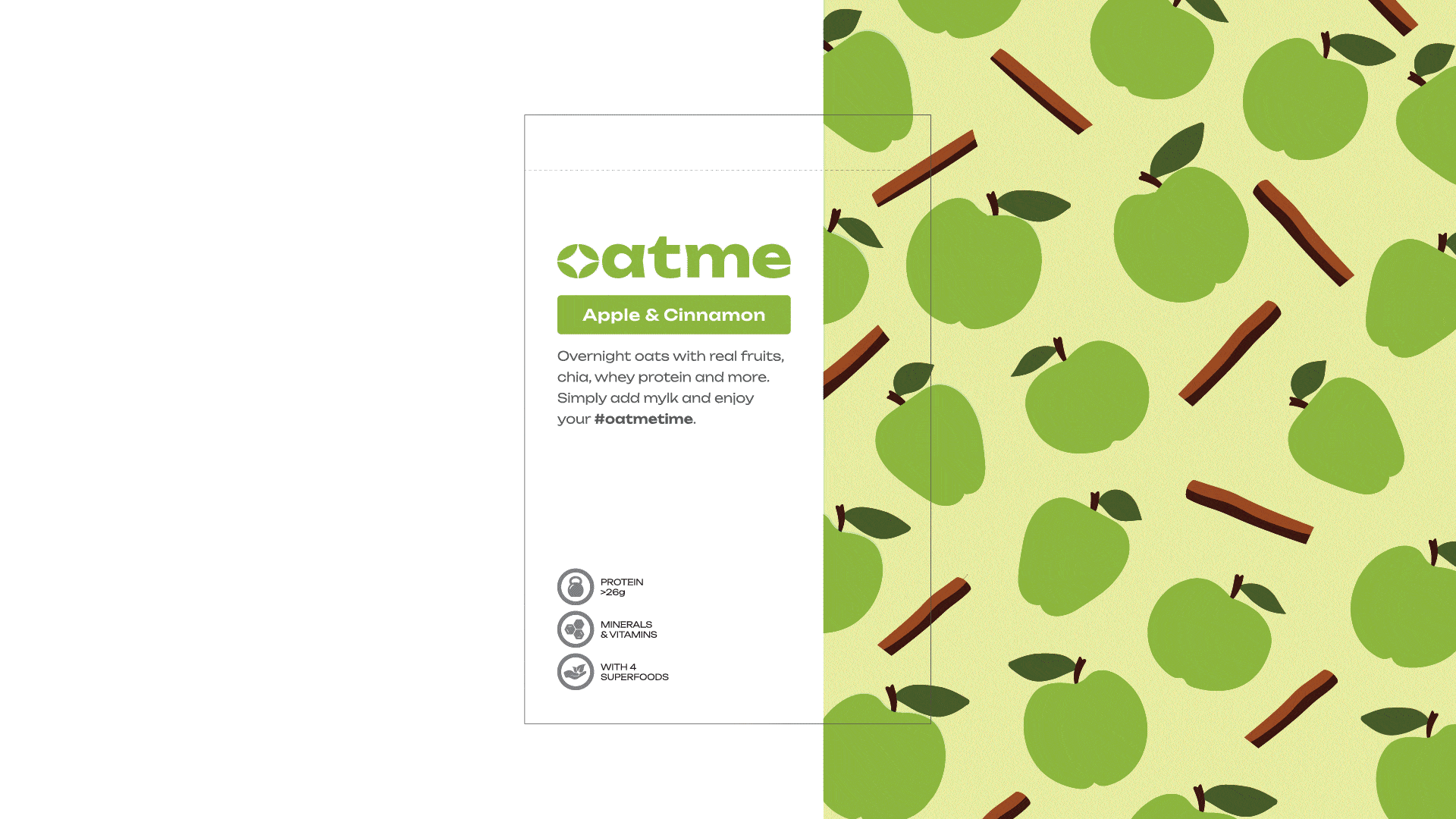
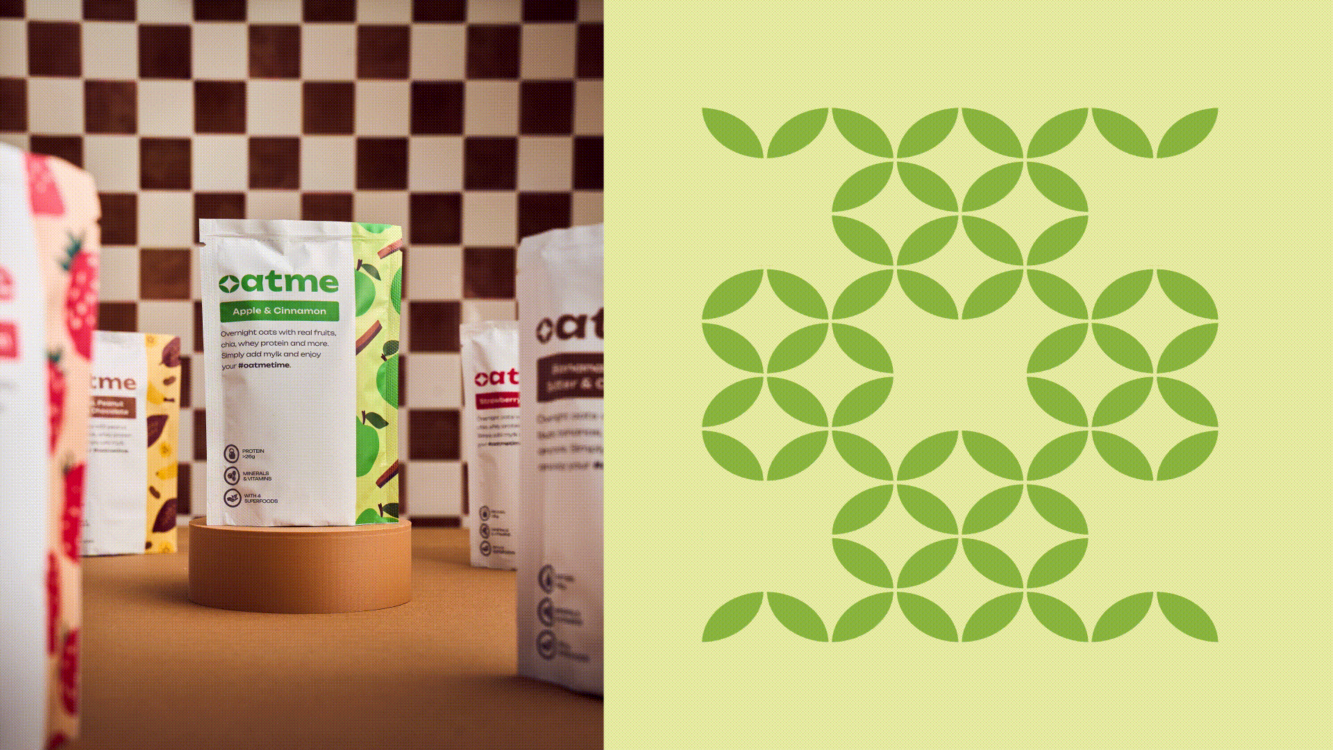
That is why the packaging focuses on one main thing: to be transparent and honest about the characteristics and advantages of the brand. With a minimalist design, Oatme's message is conveyed directly to you. Nothing more, nothing less. Just the right amount of visual elements and text. Just like the amount of goodies in Oatme's pouches
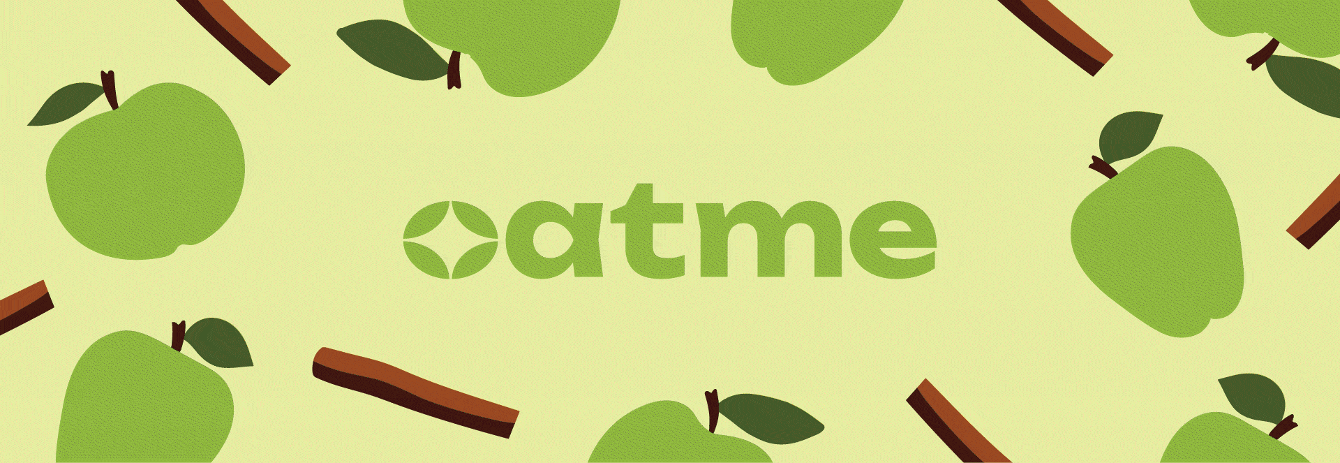
The Oatme logotype and symbol speak to anyone who takes their fitness seriously. Bold and dynamic, but at the same time with nature in its DNA, the logo encourages you to never give up, never settle for less. But never forget about your mental and physical well-being and the nutrients you take. Oatme reminds you to stop for a moment, forget about the ticking clock, annoying notifications, or tasks on your to-do list, and take the time to recharge. To take your time.
Credits:
Client: Oatme
Logo & Package Design: Nikolay "Neke" Malinov
Product Photography: Obrazetz Productions
Social Media Content: Iveta Stancheva
Product Videography: Ivan Zdravkov
Client: Oatme
Logo & Package Design: Nikolay "Neke" Malinov
Product Photography: Obrazetz Productions
Social Media Content: Iveta Stancheva
Product Videography: Ivan Zdravkov